


BRAND STRATEGY | BRAND IDENTITY | GRAPHIC DESIGN
FINANCE

The Mann brings structure and sophistication together. Finance meets fine art, creating a brand that speaks with authority while carrying a sense of cultural refinement. Every detail reflects trust, discipline, and prestige, positioning the brand as both timeless and forward thinking.


THE DESIGNER
Pulling from both structure and culture, finance is represented through sharp lines, grids, and muted neutrals. While, fine arts come in with textures, brushstrokes, and layered depth. The images feel stable yet not rigid. Trust and credibility anchor the board, but there’s also an emphasis on refinement and intellectual curiosity.
THE MARKETER
The Mann Investment positions itself as more than finance. It is a cultural authority that merges sharp business acumen with refined artistic appreciation. This duality makes the brand attractive to professionals who seek both trust and sophistication. The brand imagery signals credibility, legacy, and elevated taste, setting it apart in a traditionally rigid market.

 |
|---|
 |
 |
 |
 |
 |
 |
THE ART DIRECTOR
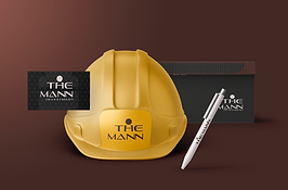
The Mann Investment is a brand that operates at the intersection of structure and sophistication. Visual direction emphasizes balance: geometric precision paired with fine arts. We are creating a world where finance feels less transactional and more cultural. Legacy, discipline, and refinement guides every creative choice. Typography is timeless and bold, supported by cultured palette.


